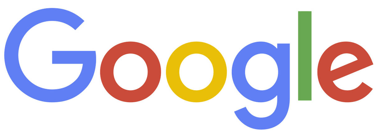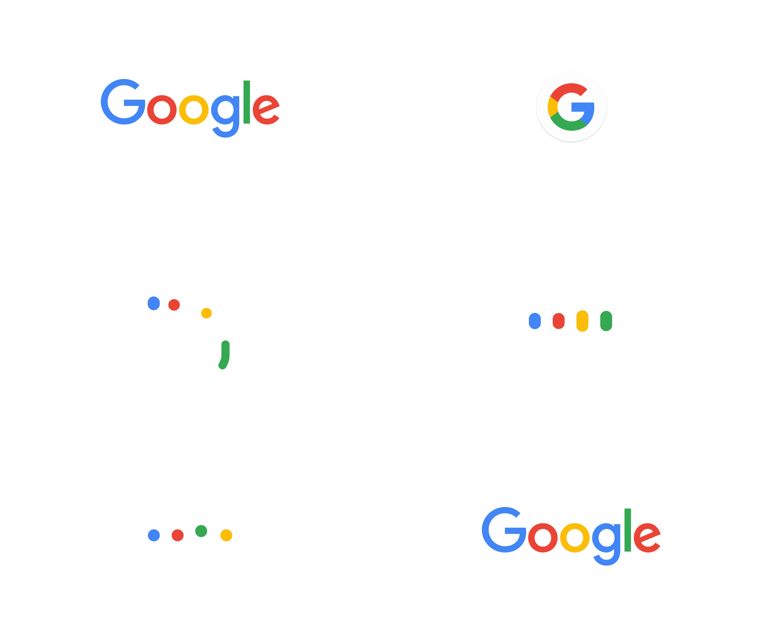

If you’ve been on the internet, you’ve noticed a few changes to your favorite search engine. Last week Google unveiled it’s new logo design to its users (nearly 65% of ALL web users!) through it’s popular Google doodles on the home page. Right in front of our eyes, we saw our Google browser transform in front of our eyes. The old logo turned into the new logo, and we were walked through all the different brand elements that also changed, including the favicon, and secondary logos. The update was not only about moving their brand forward, but also had practical applications.
“As you’ll see, we’ve taken the Google logo and branding, which were originally built for a single desktop browser page, and updated them for a world of seamless computing across an endless number of devices and different kinds of inputs (such as tap, type and talk).” (excerpt from Official Google Blog)
While any business rebrand can stretch across several components, a brand refresh of Google proportions seems nearly impossible to manage; but not for Google. Unlike the Tennessee Logo controversy, where representatives planned to roll out the new logo in phases, leaving a mixed and confusing message, Google unveiled each logo and branding change at the same time, maintaining brand clarity, message and tone. The major rollout was well planned, and had probably been in process behind the scenes for quite some time to make sure every piece of their Google-branded pie was addressed.
Industry reaction the the change has been mixed; although as Fortune notes, neither opinion was polarizing to the point of concern. Both end users and the design community have reacted to the logo, some adoring the fresh look, while others aren’t impressed with the flat, simple design. Fortune goes on to say that this lack of opinion is a win for the brand, nothing that many companies have received such negative reactions they’ve seen stock prices and sales drop upwards of 20%.

No matter the opinion you have of the rebrand, one thing is certain: the world’s biggest brand got it right. Below are three key lessons we can learn from Google’s major rebrand.
1. Consistency- All elements of the logo design, including favicon, icon, full color logo and secondary logos all received the same treatment. Additionally, subsidiary applications like Google My Business, Google Calendar and it’s other apps will receive the same treatment. The brand fluidity between all of the Google components create a strong brand message and keep the message clear.
2. Roll-Out- Before Google announced the new logo design on September 1, we can be sure several months of planning went in to creating the best plan of action. The full rollout and introduction of the new logo through Google’s popular doodle feature on the home page showed that Google understood it’s user, knew the best way to reach them effectively, and helped them process the change before blasting it across all it’s network.
3. Brand messaging- The previous logo design paid an homage to news, reading and literature with serif fonts. The new logo goes full tech, with clean lines, non-serif font and responsive design that is useful across many tech devices, screens and applications. The new logo design has not only given Google a new look, but also speaks to where they are focused on the future.
“[The] update is a great reflection of all the ways Google works for you across Search, Maps, Gmail, Chrome and many others. We think we’ve taken the best of Google (simple, uncluttered, colorful, friendly), and recast it not just for the Google of today, but for the Google of the future.” (excerpt from Official Google Blog)
Are you ready for a major rebrand? A custom logo from LogoGarden allows you to get exactly what you want for your business, without having the experience of a graphic designer. Our designers will work with you to identify what makes your business unique and how to translate that into a brand identity that defines you. To learn more, contact us.