In the event another person or organization wants to use your logo, it’s important you are fully and wholly represented.
Ensuring that your brand message is communicated consistently across all marketing mediums and customer touchpoints is much simpler to do with a set of brand guidelines. As your business grows and evolves it’s likely that someone other than you will be in charge of maintaining your brand, and providing guidance for a designer will ensure a seamless, unified look through that growth.
Brand guidelines include everything from proper colors, sizing, fonts to taglines, trademarks and titles. A misrepresentation of your brand can tarnish your voice, and ultimately your identity.
Identifying the core colors of your logo is important for brand identity. Failing to associate specific color hex codes as well as CMYK (for print) or RGB (for web) can lead to misrepresentation that can lead to confusion. It’s also important to identify the black and white versions of your logo and if any variations should be used.
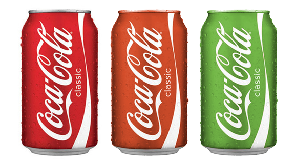
You may have spent several hours hashing out the right color balance for your logo, and failing to represent that time may mean that others take it upon themselves to fill in the blanks, changing reds to magentas, sky blue to royal, etc. Can you imagine if designers for Coke didn’t have specific guidelines, and were able to tweak colors? What started out as a classic red eventually may be represented by an orange hue, and overtime can fall even further away from brand. It’s safe to say the orange and green cans do not promote the classic, all-American reputation that Coke has become known for.
Not only should your logo have color standards, but it’s important to have scalability restrictions on your logo to maintain it’s integrity. Many top brands such as eBay have standards for which the logo can be reproduced. By posting a minimum size requirement, you are protecting your logo from becoming illegible. It’s also important to make it clear that the logo must be scaled appropriately and cannot be stretched, or widened to fit into a particular space. This helps keep clean, neat lines and will prevent customers from the difficult task of decoding the stretched image or name.
Which would you rather have represent your brand?
![]()
If your logo is text-based, there will eventually be a time when your logo is recreated. Failure to provide font guidelines can mean your logo is reproduced with the wrong font, skewing the brand perception ever so slightly. As we saw with the Coke example above, a slight skew over time can lead to major changes that no longer properly represent your brand.
Aside from the fonts used on your logo, any taglines, website fonts or print fonts should remain consistent and aligned to help strengthen your brand. Failure to identify those fonts, appropriate weights and colors can turn people off with the lack of consistency.
Creating a brand for your business is one of the biggest assets for continued growth and helps customers to connect with you, your product or service, and represents the benefit of what you have to offer. Without a clear, concise brand, potential customers may be turned off before they ever interact with your brand. To learn more about branding and your logo, download our latest whitepaper, The 4 Essentials of Great Logo Design