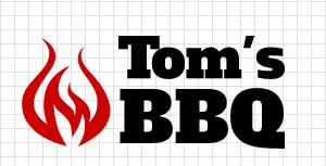
Your creativity will be front-and-center when choosing the layout of your logo. It can be one of the most important techniques in designing a logo that is unique and different. Our free online logo maker makes laying out and aligning your logo a snap.
There are many ways to layout your logo design using a symbol and text. Here we present four basic layouts that are easy to duplicate to help inspire your designs:
Your company name is first to be seen and read when placing it to the left of the symbol. This layout works well for two lines of text or one line featuring a name and second line as a tagline. Use of the alignment tool in our logo maker will help center your logo design.
This is the most popular layout of all logos made online in our logo maker. Similar to the symbol on the right side of your company name, this design is ideal for two lines of text. The primary difference is that the symbol becomes more of the focal point than company name.
Placing your symbol on the top of text can balance out the logo design. Considerations for this layout should include its application and use online vs. offline. The logo maker’s alignment tool makes centering these elements a breeze.
Logo symbols in the middle can be some of the most creative logo designs around. A good symbol can become a part of the text or company name simply by aligning multiple text boxes to the symbol. As with the vertical design above, consider the size of the logo and how it will be used. These logo designs need more width to be used effectively.
In future tutorial posts we’ll cover more advanced layouts that can be achieved in our logo maker such as arching text or spacing text around a symbol. In the meantime be sure to review our Logo Design Tips page and enjoy our latest YouTube video about how to layout your logo: